
All the names, logos and characters of “Turma da Mônica” are property of © Mauricio de Sousa Produções.
These materials are being displayed here for disclosure purposes only.
These materials are being displayed here for disclosure purposes only.

Identidade visual - Castelo do Terrir
O projeto Castelo do Terrir surgiu a partir da solicitação de um espaço temático inspirado na atração do Parque da Mônica do Shopping Eldorado. A ideia era unir terror com o universo da Turma da Mônica e da Turma do Penadinho.
O projeto Castelo do Terrir surgiu a partir da solicitação de um espaço temático inspirado na atração do Parque da Mônica do Shopping Eldorado. A ideia era unir terror com o universo da Turma da Mônica e da Turma do Penadinho.
Terrir une terror e risada, assim temos um espaço onde as crianças poderam brincar e interagir com elementos visuais das histórias da Turma do Penadinho.
Utilizamos nesta identidade visual o Zé Vampir por ser um personagem com alto contraste (amarelo) e por remeter ao universo dos vampiros, que desperta muito a curiosidade das crianças que são o público-alvo da atração. A Mônica também apresenta a atração pois é o carro chefe da empresa e traz um reconhecimento imediato do universo Mauriciano.
The Terrir Castle project arose from a request for a themed space inspired by the Monica's Park attraction at Eldorado Shopping Mall. The idea was to combine horror with the universe of Monica's Gang and Penadinho's Gang. Terrir combines horror and laughter, so we have a space where children can play and interact with visual elements from the stories of Penadinho's Gang.
We used Zé Vampir in this visual identity because he is a character with high contrast (yellow) and because he refers to the universe of vampires, which arouses the curiosity of children, who are the target audience of the attraction. Monica also presents the attraction because she is the company's flagship character and brings immediate recognition of the Mauricio universe.
We used Zé Vampir in this visual identity because he is a character with high contrast (yellow) and because he refers to the universe of vampires, which arouses the curiosity of children, who are the target audience of the attraction. Monica also presents the attraction because she is the company's flagship character and brings immediate recognition of the Mauricio universe.
A combinação da identidade visual traz ao fundo a silhueta de um castelo, pois o espaço temático tem esta estrutura com as atrações atreladas à ele. A ideia foi fazer com que os personagens apresentasse o castelo ao fundo com a expressão leve e sorridante, para que todos se sintam 'bem-vindos'.
A placa com o nome da atração cria uma integração com os personagens. Utilizamos uma tipografia geométrica, com boa legibilidadde e algumas irregularidades, característica das tipografias de filmes de terror. A paleta de cores equilibra cores com tom roxo com maior opacidade, utilizando também cores que ressaltam o título e as cores dos personagens.
The visual identity combines the silhouette of a castle in the background, as the themed space has
this structure with attractions linked to it. The idea was to have the characters present the castle in the background with a lighthearted and smiling expression, so that everyone feels ‘welcome’.
The sign with the name of the attraction creates an integration with the characters. We used a geometric font, with good legibility and some irregularities, characteristic of horror movie fonts. The color palette balances purple tones with greater opacity, also using colors that highlight the title and the colors of the characters.


Variações da identidade visual, horizontal e sem os personagens, que pode ser utilizado em contextos onde já existam outros personagens ilustrando a comunicação visual.
Variations of the visual identity, horizontal and without characters, which can be used in contexts where other characters already illustrate the visual communication.
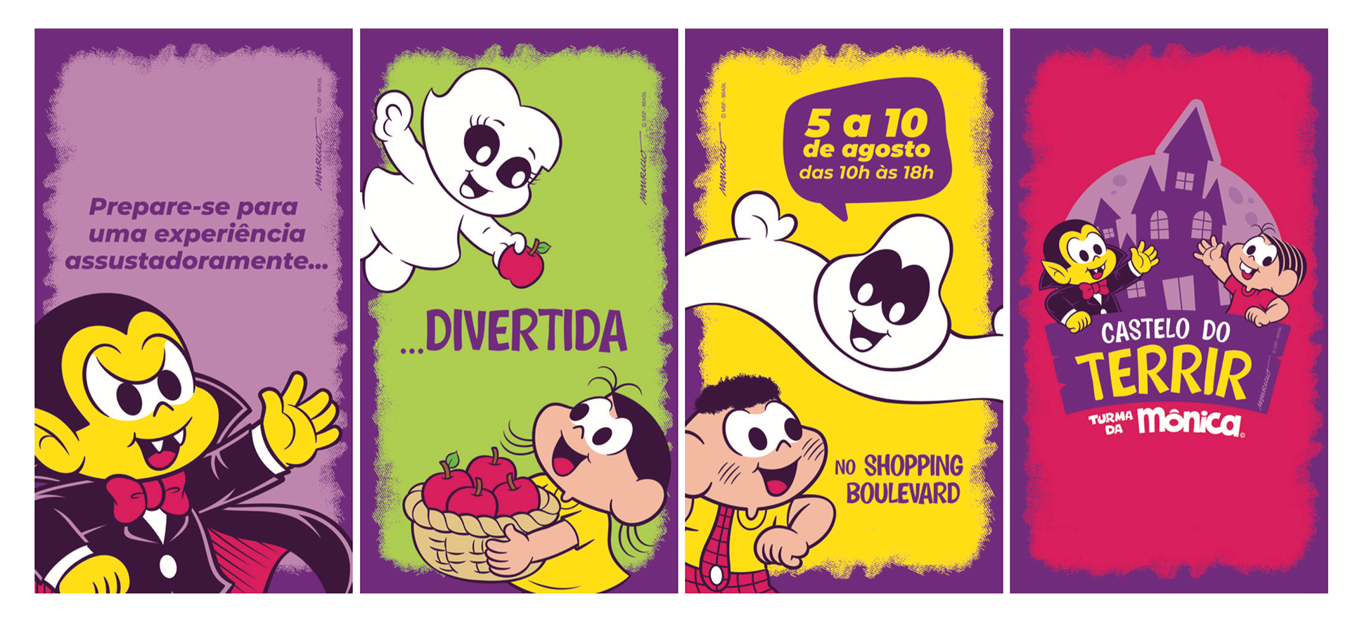
Comunicação para as redes sociais do espaço temático e parceiros.
Communication for the social media channels of the thematic space and partners.
Communication for the social media channels of the thematic space and partners.
Obrigada!
Equipes: Desenho, Criação & Design, Arte-final e MS Ao Vivo.
Designer responsável: Karen Eloise Shimoda.
Direção de criação: Ana Kirsten.
Softwares utilizados: Illustrator.
Equipes: Desenho, Criação & Design, Arte-final e MS Ao Vivo.
Designer responsável: Karen Eloise Shimoda.
Direção de criação: Ana Kirsten.
Softwares utilizados: Illustrator.