
Logotipo - Editora Inteligente
A equipe da Editora Inteligente tinha em mente que o logotipo precisaria ser moderno mas também combinar elementos mais clássicos.
A equipe da Editora Inteligente tinha em mente que o logotipo precisaria ser moderno mas também combinar elementos mais clássicos.
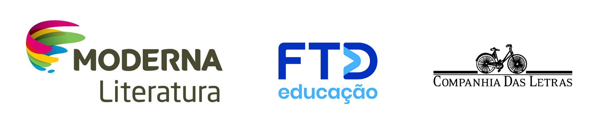
Nossa primeira conversa conversa trouxe referências de outras editoras que eles tinham como referência de marcas consolidadas (abaixo), que utilizavam elementos dos quais eles gostariam de ter na editora: cores e elegância.
The Editora Inteligente team had in mind that the logo would need to be modern but also combine more classic elements. Our first conversation brought up references from other publishers that they considered to be established brands (below), which used elements that they would like to have in their publishing house:
colors and elegance.
colors and elegance.
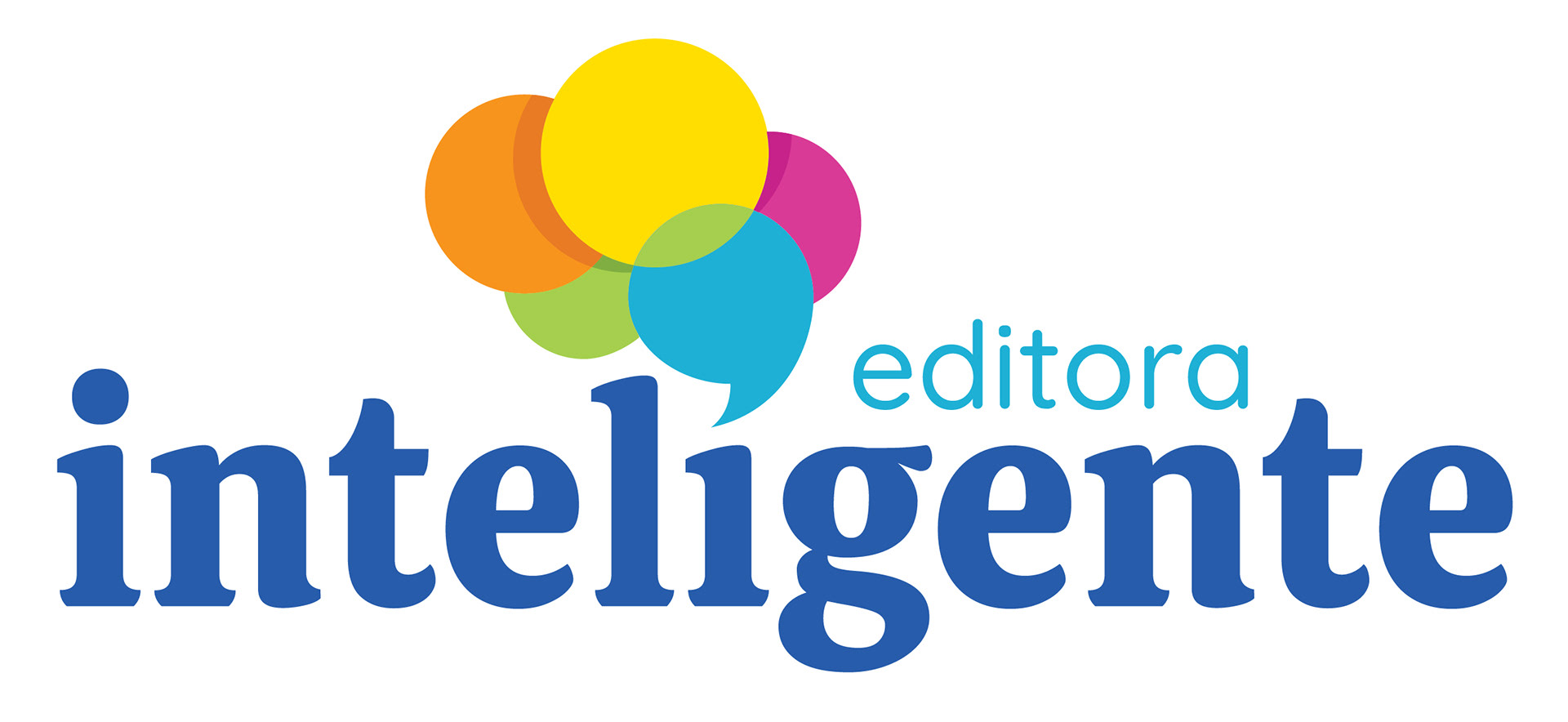
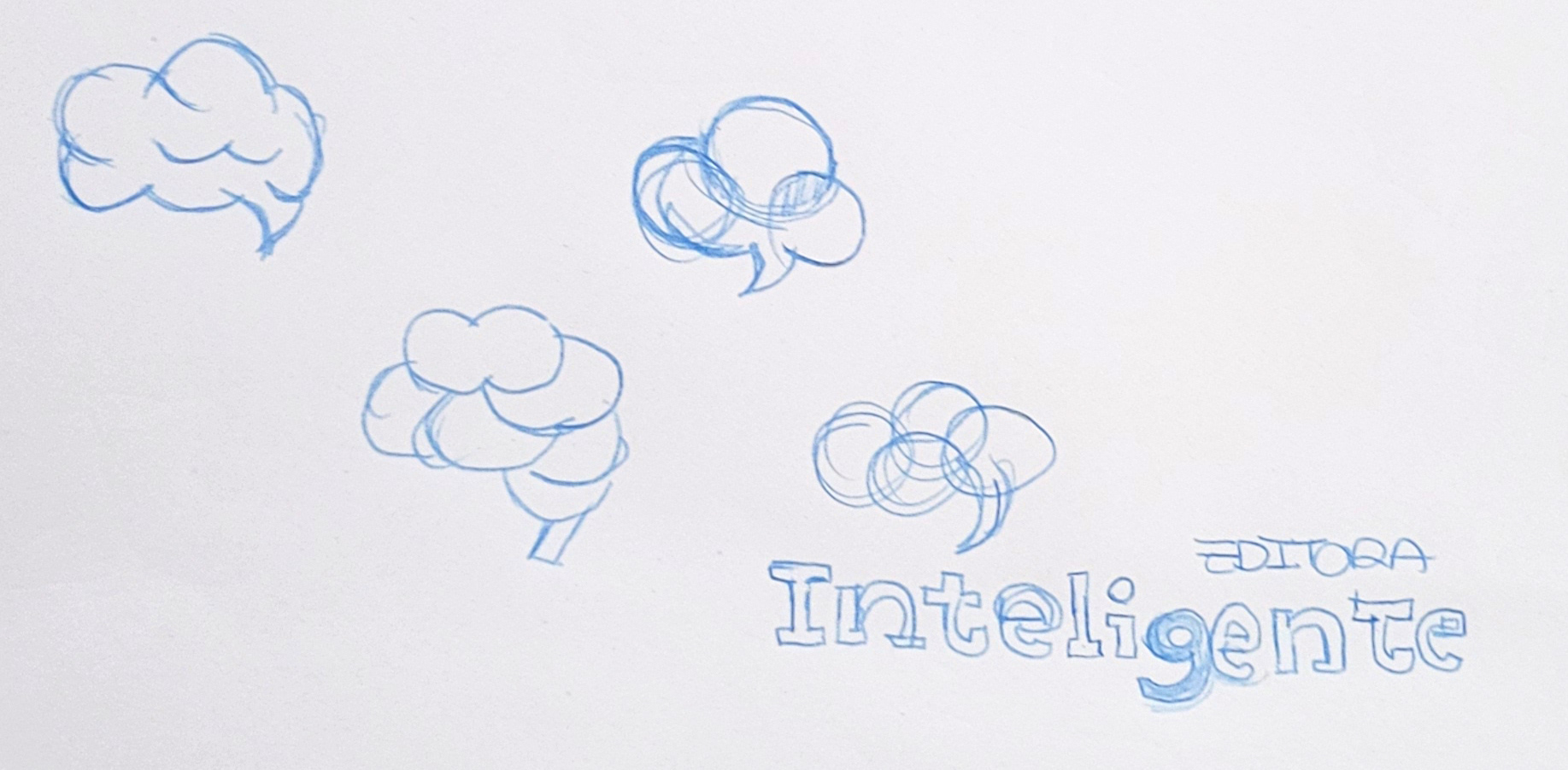
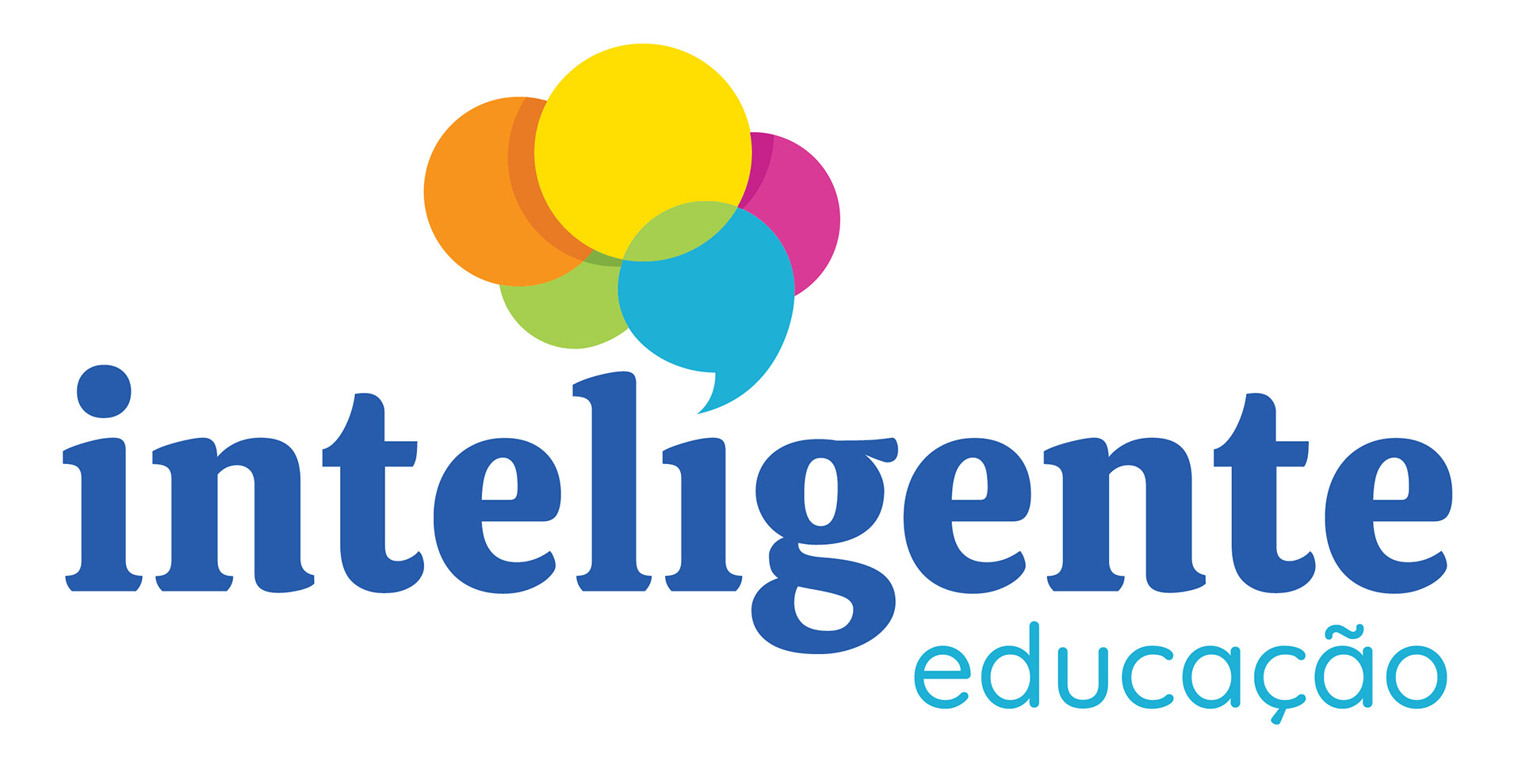
O elemento gráfico do logo surgiu a partir de estudos da forma do cérebro, com suas áreas divididas por campo de atividade, passei a explorá-la com cores e a fusão entre circunferência estabelecendo novas conexões.
A ápice utilizada na base desse cérebro representa a fala, a comunicação e a interação da palavra inteligiente com o elemento gráfico como pingo da letra "i".
A tipografia escolhida utiliza de serifas bem estruturadas, porém, com acabamento moderno.
The graphic element of the logo arose from studies of the shape of the brain, with its areas divided
by field of activity. I began to explore it with colors and the fusion between circumferences, establishing new connections. The apex used at the base of this brain represents speech, communication, and the interaction of the intelligent word with the graphic element as the dot of the letter “i.” The chosen typography uses well-structured serifs, but with a modern finish.
by field of activity. I began to explore it with colors and the fusion between circumferences, establishing new connections. The apex used at the base of this brain represents speech, communication, and the interaction of the intelligent word with the graphic element as the dot of the letter “i.” The chosen typography uses well-structured serifs, but with a modern finish.
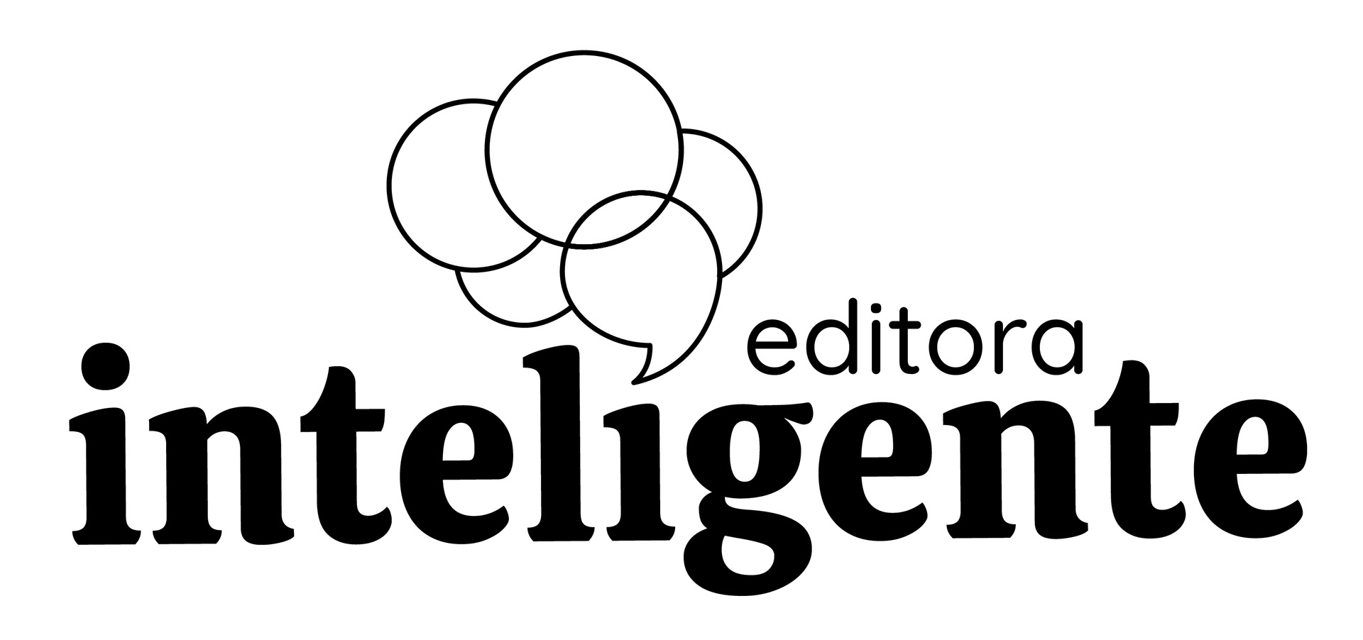

Variação do logotipo em 1 cor e no fundo escuro.
Variation of the logo in one color and on a dark background.
Variation of the logo in one color and on a dark background.
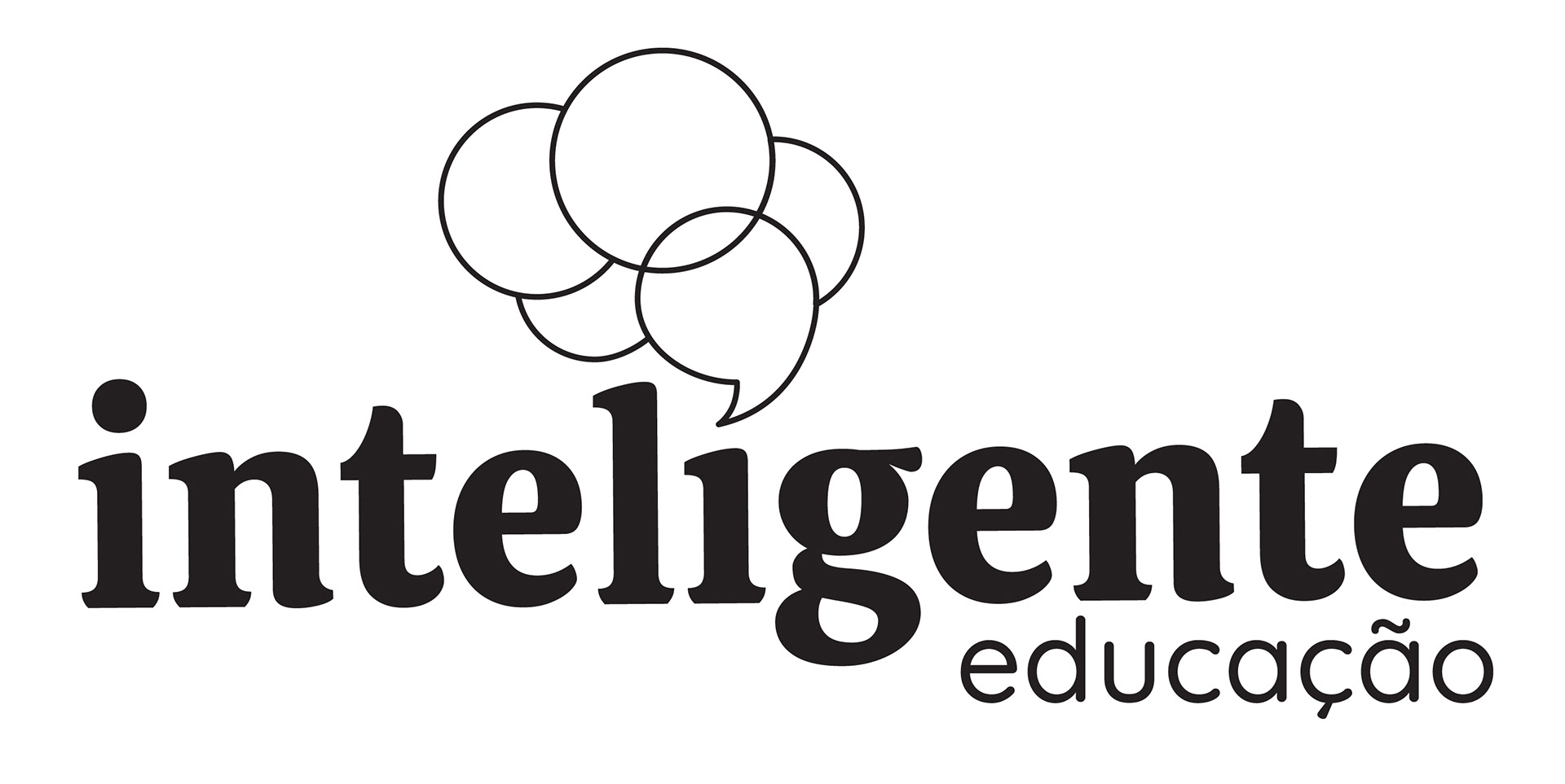
Variação do logotipo em para outra área da editora, focada em educação.
Variation of the logo for another area of the publishing house, focused on education.
Variation of the logo for another area of the publishing house, focused on education.
Obrigada!
Designer responsável: Karen Eloise Shimoda.
Direção de criação: Karen Eloise Shimoda.
Softwares utilizados: Illustrator.
Designer responsável: Karen Eloise Shimoda.
Direção de criação: Karen Eloise Shimoda.
Softwares utilizados: Illustrator.